
Goal:
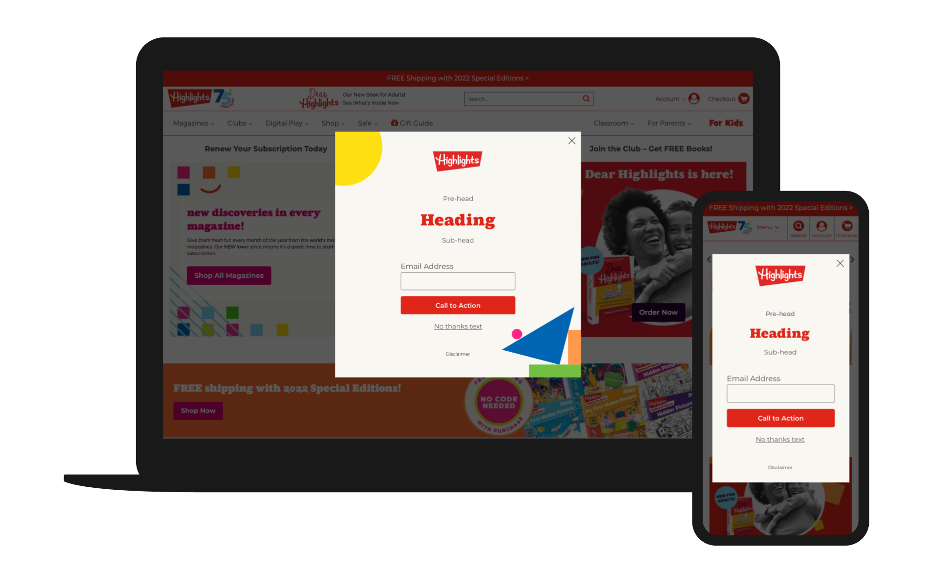
The current designs for Highlights lacked the iconic “playful” component you see on their products. The goal was to develop a playful yet colorful experience that was brand-adherent while using a combination of Figma and Illustrator. A unique part of this process was incorporating a visual component that was age appropriate for the kids; I decided to represent those wooden building blocks you often see on playsets and use them as geometric shapes across the different experiences, all while using bold and vibrant kid-friendly colors.
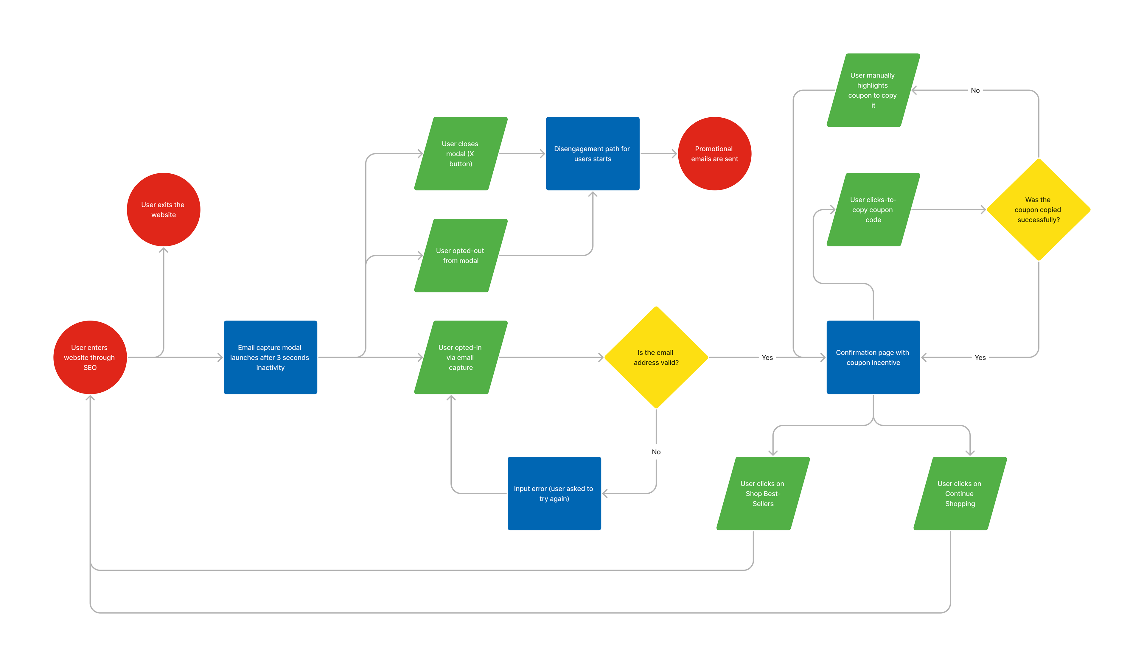
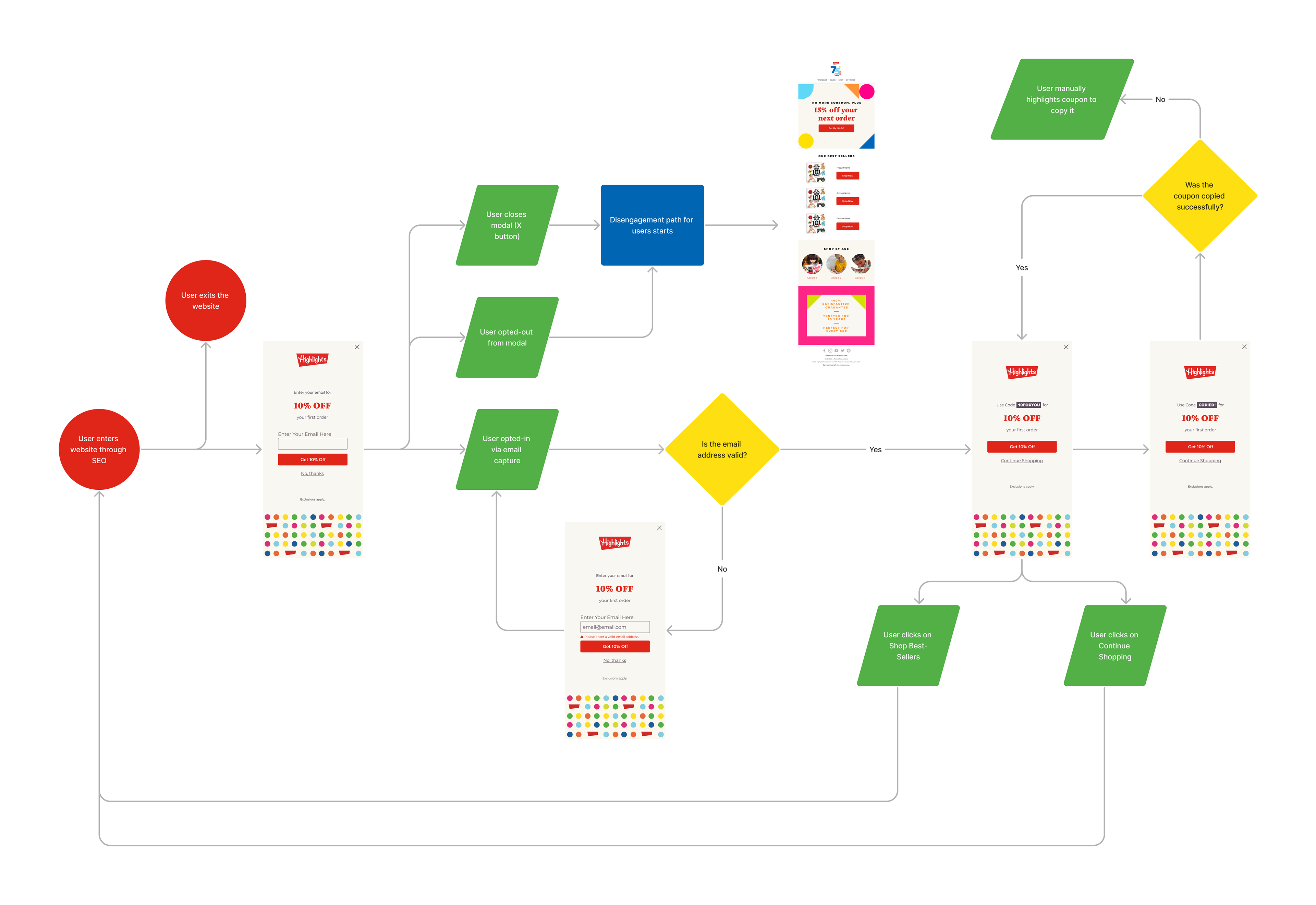
Detailed user flow defining user interaction with an email capture overlay.
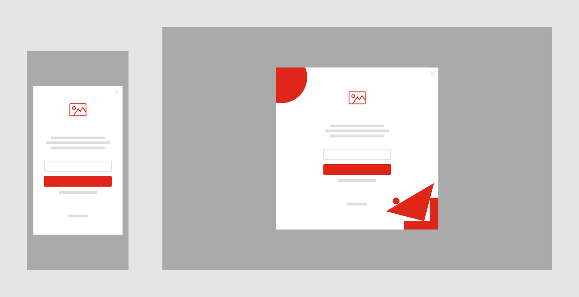
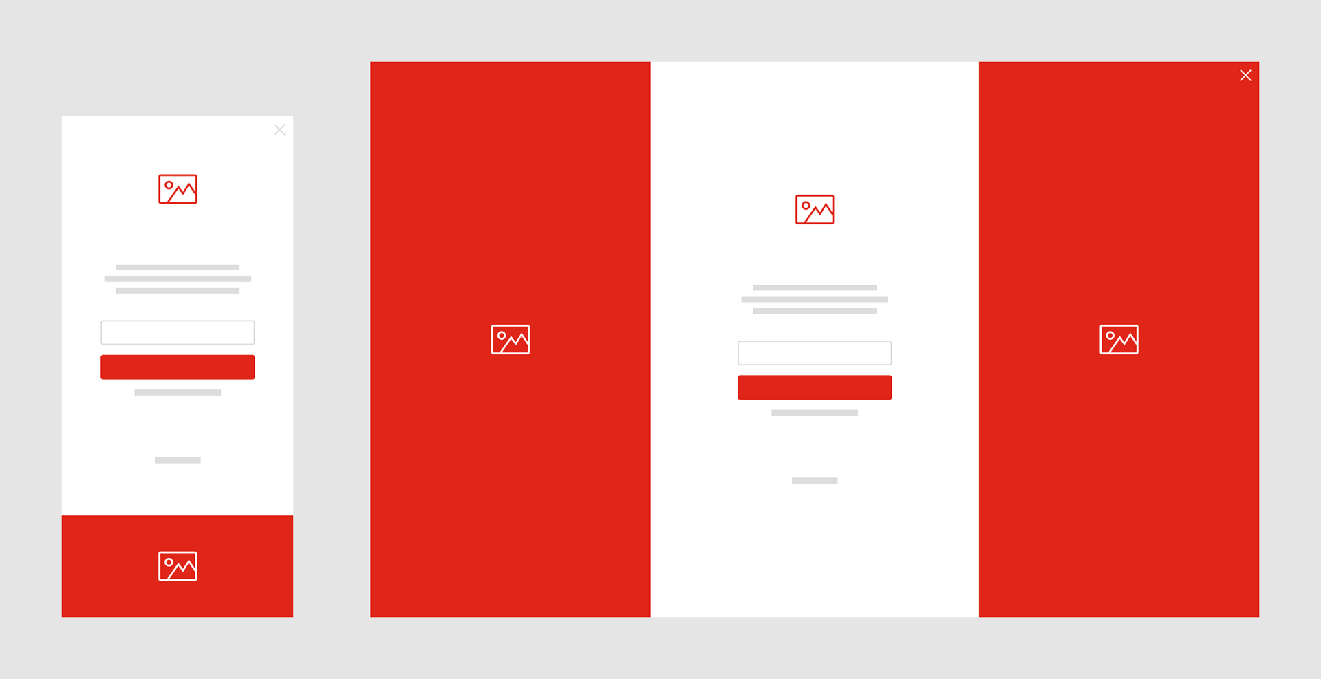
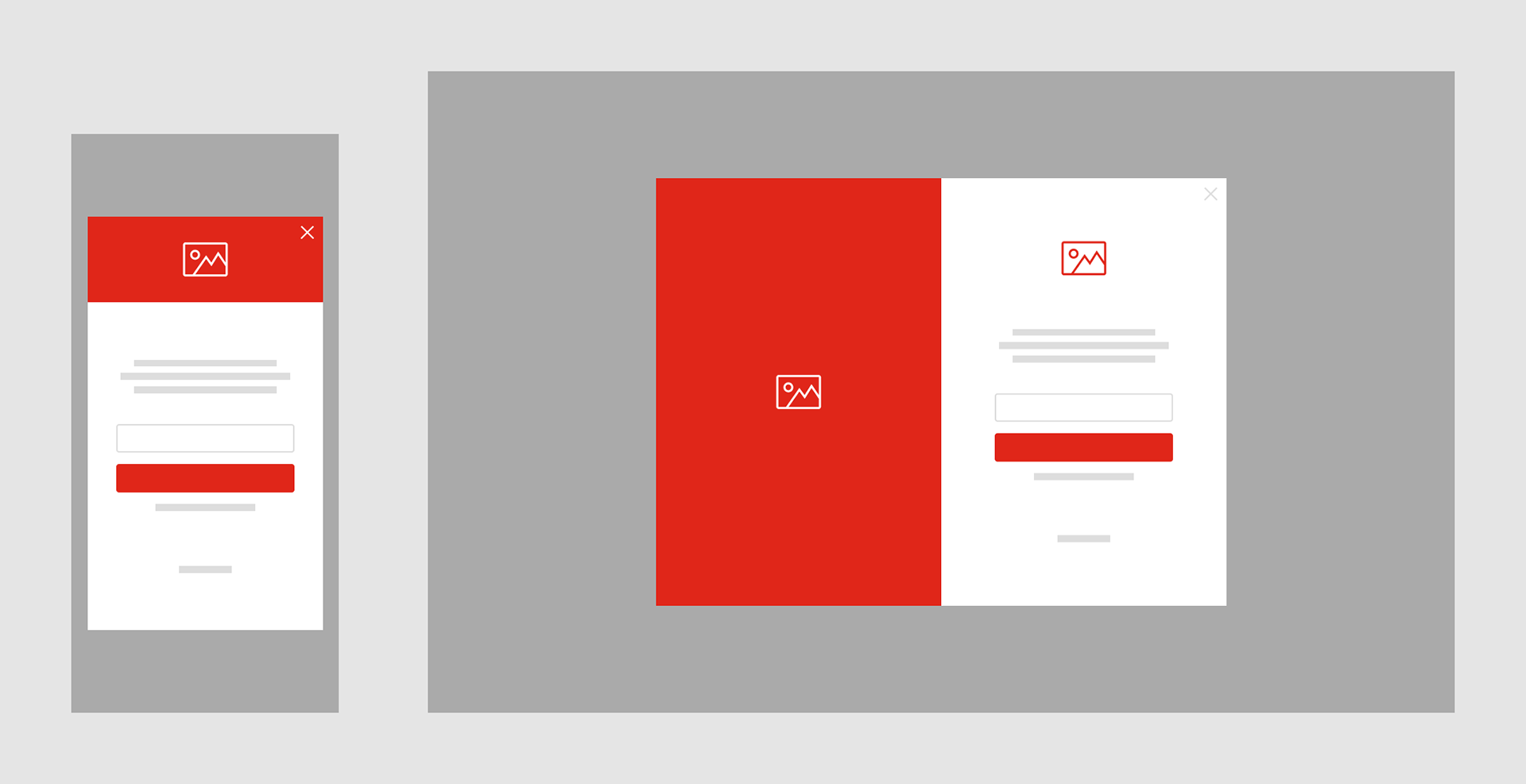
Research gathered from brainstorming led to the design of low-fidelity wireframes.
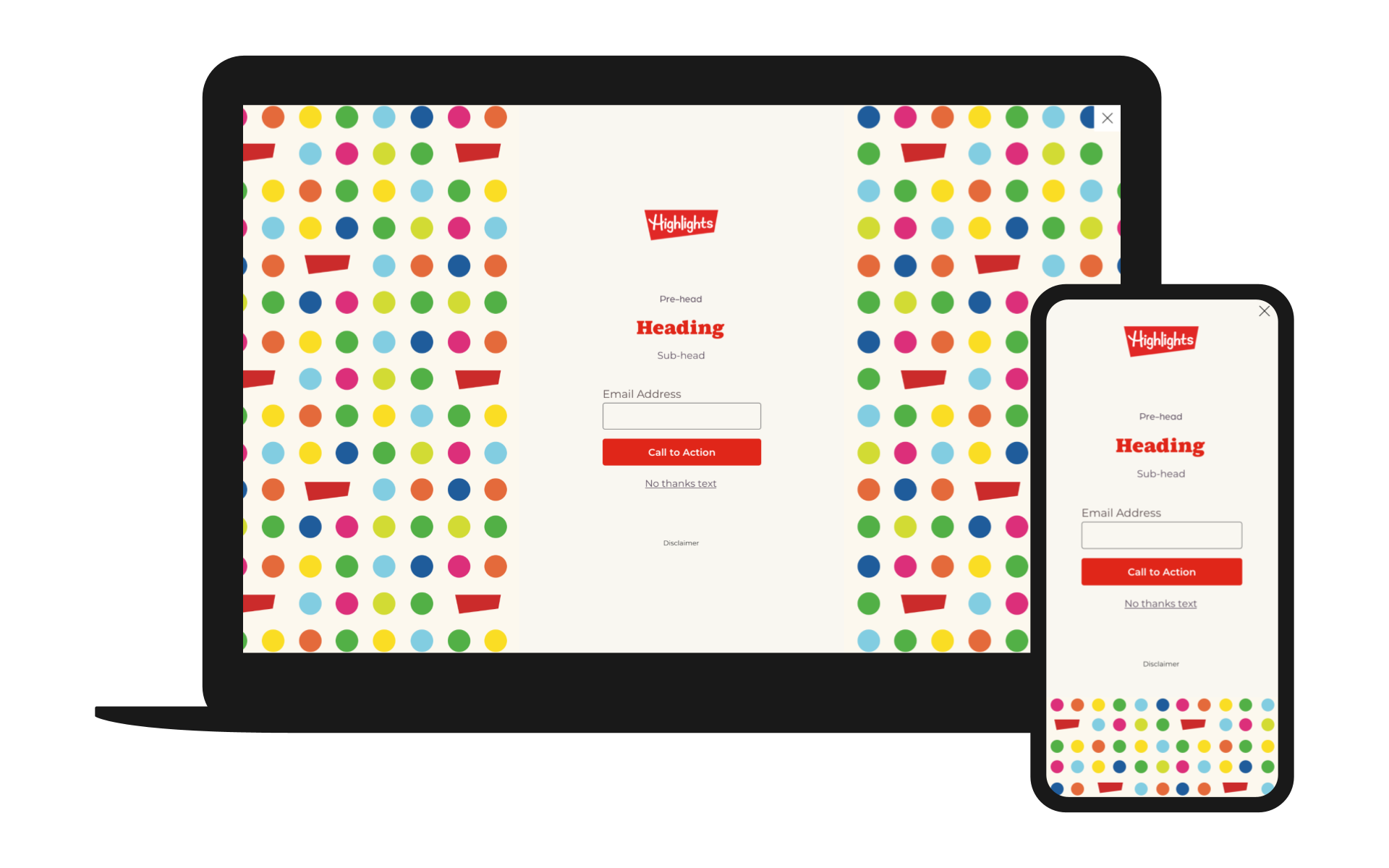
Playful use of colors and shapes as a pattern invites the user to interact with the experience.
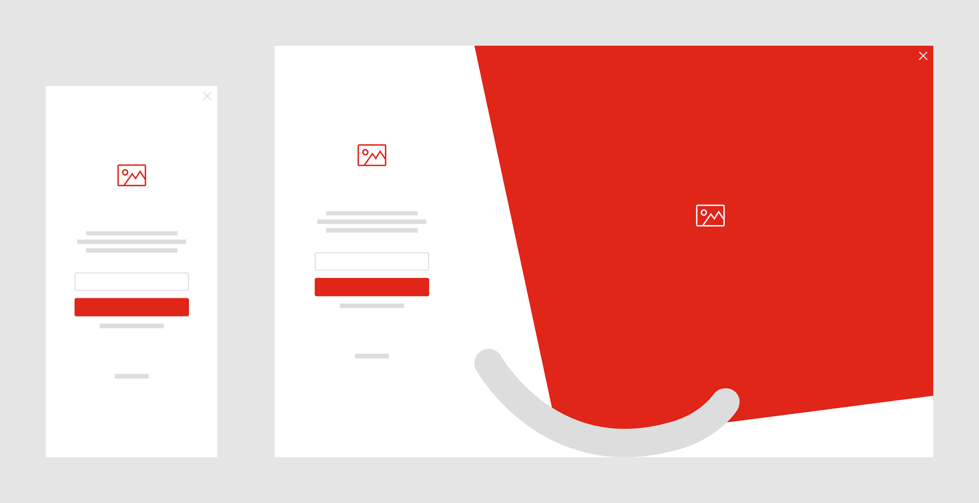
Dynamic use of geometric shapes helps the user's eye navigate the experience while providing a minimal look.
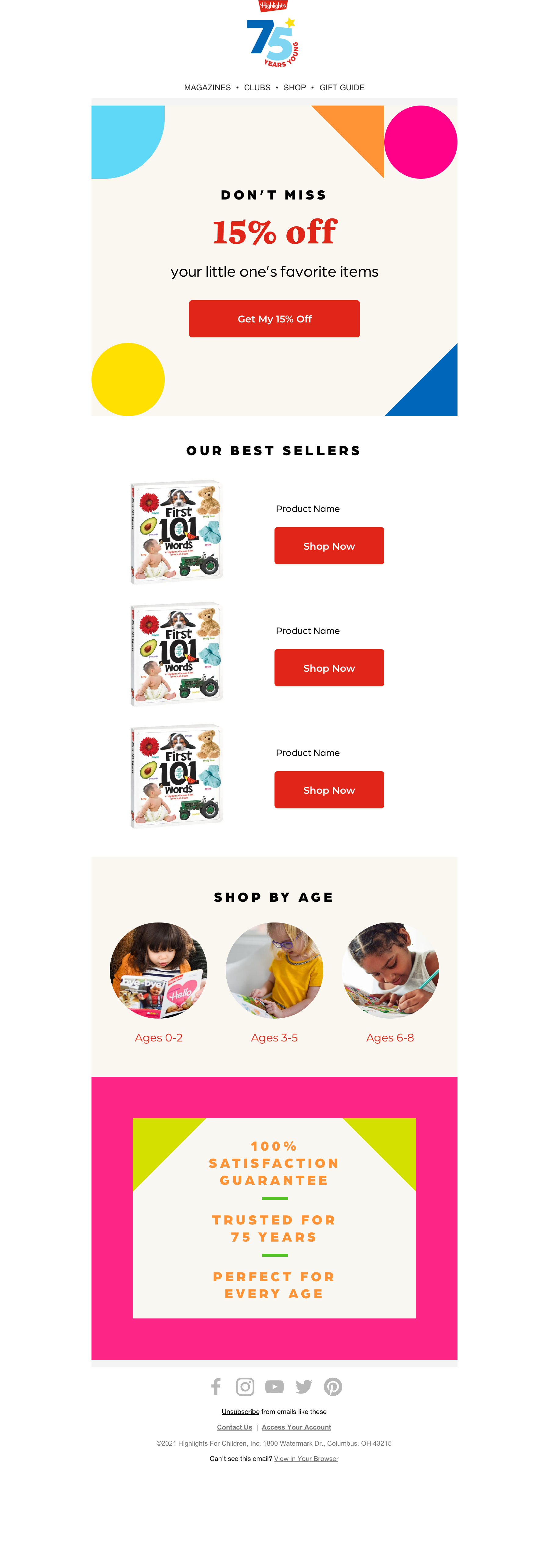
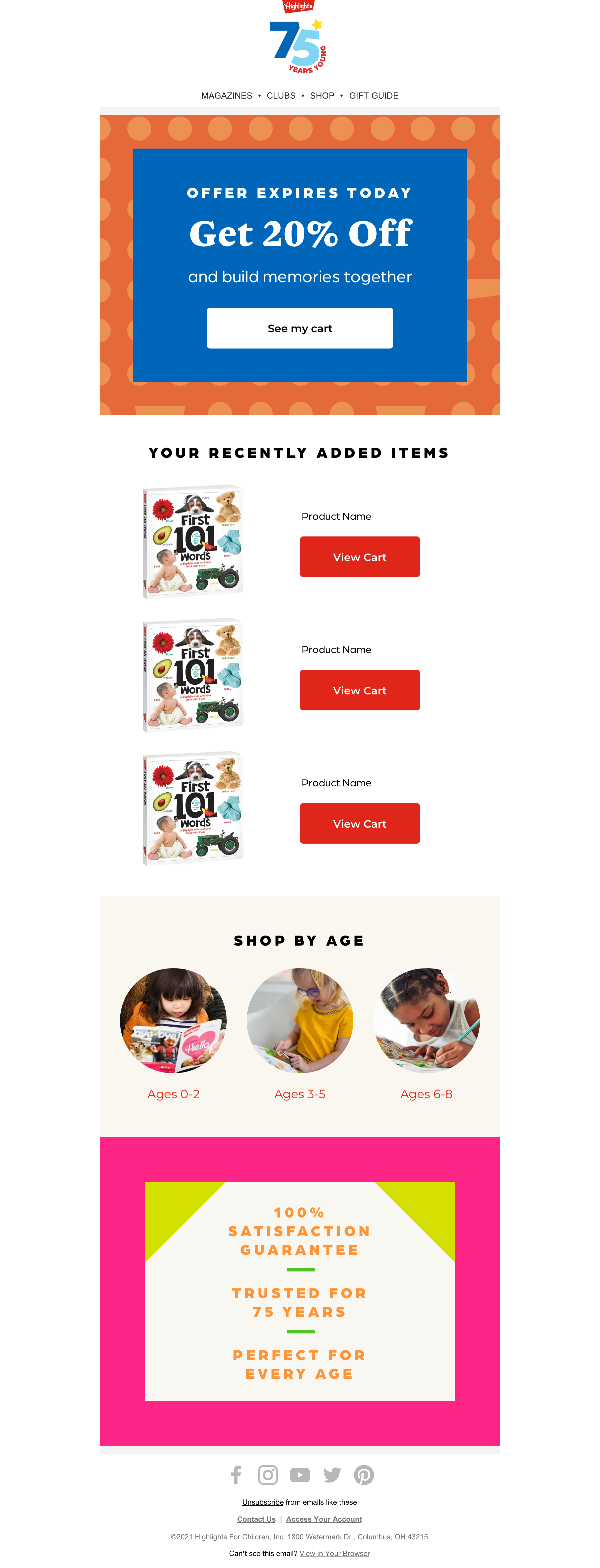
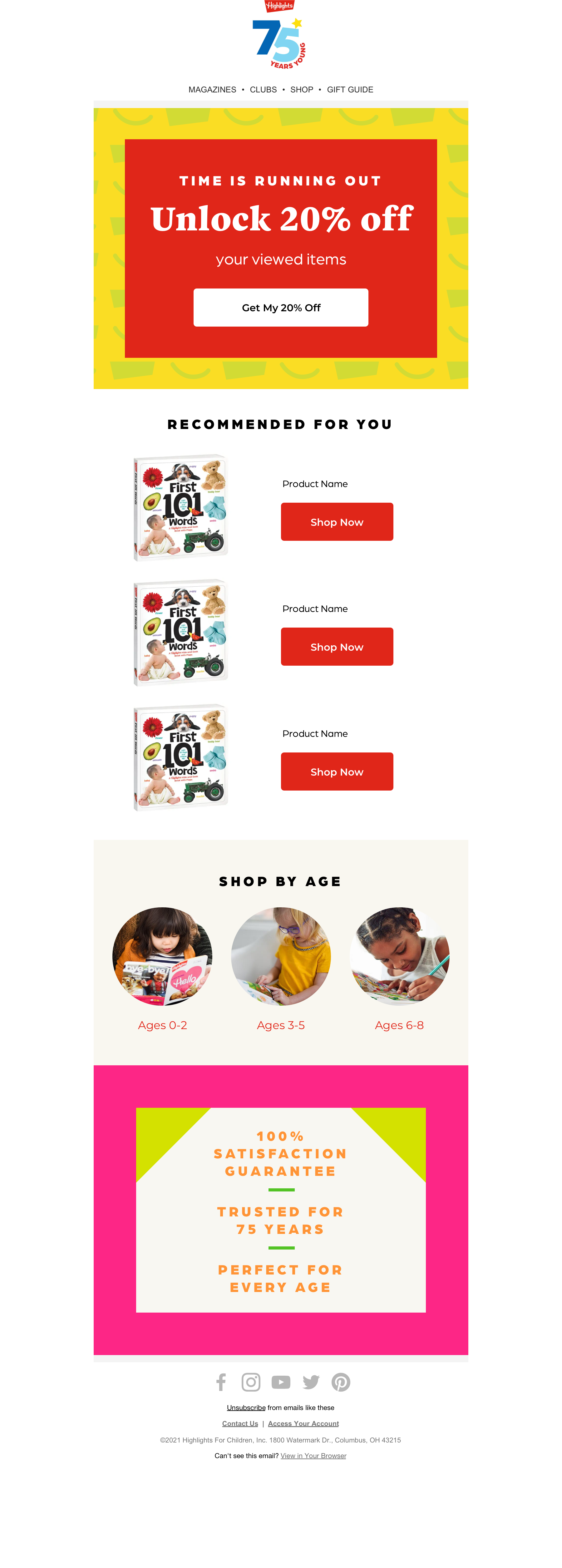
Triggered email designs follow the client’s marketing email styles for consistency.